|
|
|
| Dreamweaver MX - bypasses version 5 to deliver a brave, new editor | |
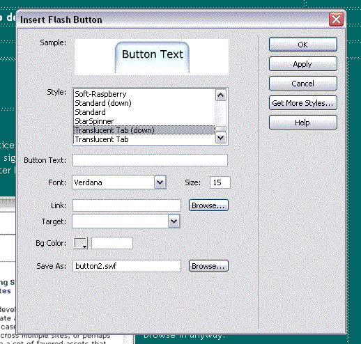
26/05/02 Flash buttons! I guess this feature is going to be most appropriate for people that either don't already have Flash or who could not get the hang of making Flash buttons, or then again perhaps it's just for the super-lazy. No matter what category you fall in, I'm sure that this will be quite the time saver. While I'm in the area of extensions, there aren't many yet that work with Dreamweaver MX and this does include extensions that worked with version 4 and below. If you have a particular extension that you can't live without, I suggest waiting for the extension to be updated for the MX architecture before laying out the dollars to upgrade the application. Like the Apple OSX users are finding out, it's horrible to shell out money for software only to find you're doing more work in the previous version. I've also found that Dreamweaver MX does not support the use of "*" as a measurement, which is truly annoying. I had to piss-fart around with this page to get the tables to work I can't workout why this needed to be removed. Perhaps someone with a stronger knowledge of actual coding would have a better idea. I can report too that I have not had any of the interface glitches I was getting with version four. Mainly these had to do with the tops of toolbars expanding over the top of the controls.
|
26/05/02 Just pulled up the help for the first time and noticed something that's becoming increasingly uncommon with applications: old-style help rather than HTML help. What this signifies, I do not know but I think it's odd that a HTML application uses .chm help files, even when it's slightly older sister FlashMX uses HTML help.
The other advantage I find with this interface setup is that it forces me to look at the site at well below 1024 width (the default page display is sitting at 931 pixels), which is in the range that most people browse in anyway. In the Flash review I was doing I was critical of Flash having it's Preview keyboard command changed from plain old F12 to CTRL+F12, a minor annoyance but annoyance nonetheless. In Dreamweaver, released really only one month later, F12 remains preview, and CTRL+F12 is preview in secondary browser. my gripe now is that I wish they could have been consistent about this between two packages that will be used rather closely. |

25/05/02 I've just managed to get hold of the latest version of Dreamweaver. This is something that I will enjoying playing with, because it is the central application for my indevelopment.org work. Because this is an application that I use every other day, I really look forward to putting it through it's paces. Also, Dreamweaver 4 (the previous version) had a few interface glitches with the Windows XP operating system, so I will be very curious to see if these have been resolved. Mind you, I do hate when applications skip a number, merely to keep pace with other stable applications. FlashMX is version 6, fair enough. Dreamweaver was only at version 4, making the jump to version 6 rather foolish. One thing I'm quite excited about right off the bat is the integration of the site browser into the workspace. Also, now that new files are opened as tabs along the bottom of the page area, the windows taskbar is far less cluttered. It's the small touches so far that I appreciate. Also, now that Dreamweaver supports FlashMX files, these can be previewed in the workspace (same as what it always was, but now I don't have to save down a version to get this to happen). |
|
Anyone familiar with the Dreamweaver workspace will notice that the workspace has been totally redesigned. If you were particularly attached to the old-style workspace there is the option to return to it.
I notice that although Macromedia has just recently lost a patent lawsuit with Adobe over their us of tabbed menus, no real effort has ben put into removing tabs, if anything they have multiplied. The tabs at the top seem to be particularly useful too, I'm in love with the character bar, and I've had this on my system for less than 30 minutes. This will be an on-going review, things will be added as things happen. Comments can be directed to the usual place: grant at indevelopment.org Test System reliable and stable pc |
| Author: Grant McDonald www.indevelopment.org |
 This
may have been a feature in dreamweaver 4, but I'm darned if I could
find it (I think it may have been an extension). What we have in Dreamweaver
MX are instant Flash buttons! Alright, here's a time saver that I could
have really done with over the Christmas break when I was revamping
indevelopment.
 I'm
finding that adjusting to the interface is happening quite rapidly,
thanks mainly to experience gained using FlashMX, and I'm happing knowing
that I wont have to move any more toolbars out of the way.